+21 °C, +16 °C ... +29 °C Tomorrow:+29 °C
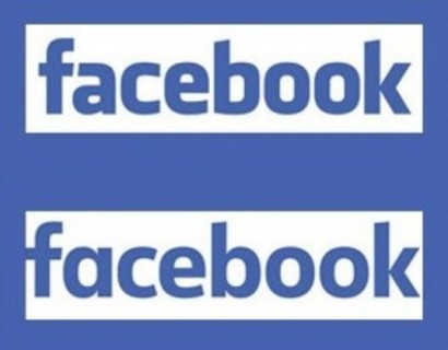
The Facebook app icon is now among the most recognisable in the world, but as more people use the service on their phones and tablets, the full, written logo is rarely seen anymore. But last night, a Facebook product designer tweeted this logo's latest design with changes that are so subtle you may not even notice them. Christophe Tauziet's tweet said: 'Say hello to the new Facebook logo' and he later responded to a question about when we will see the update with 'soon.' The blue and white colours have remained the same. Facebook has swapped the double-storey 'a' on the previous logo for a single-storey version. This seems like an unusual change because the double-storey version is how the letter is typed - and is used across computer fonts including those on Facebook - while the single-storey is more commonly seen in handwriting. By comparison, the 'b' now has a terminal and more closely resembles a typed version. |


MAMUL.am - News from Armenia, Artsakh (Nagorno-Karabakh) and the world
Republication or redistribution of MAMUL.am content is expressly prohibited without the prior written consent.
Address: 1 Charents str., Yerevan, Republic of Armenia.
Tel.: +374 (10) 55-20-59
E-mail: info@mamul.am
Tel.: +374 (91) 99-22-02
E-mail: marketing@mamul.am